The official unemployment rate is 8.3%, the official inflation rate is 3% and the Gross Domestic Product (GDP) is growing at a rate of 2.8%. So why does it seem like you know more unemployed people than the statistics would call for? Why does it seem that prices are increasing faster than the official inflation rate? And why does it seem that the economy is moribund, when the GDP is on the rise?
Does your personal experience fall more in line with an unemployment rate of 22%, an inflation rate of 11%, and a negative GDP growth rate of -2.5%? Don't be surprised. It's not your perception that's off; it's the official government statistics.
If the figures in the second paragraph seem more realistic to you than the official figures in the first, read on and we'll discover just why those official numbers look so rosy.
This Tireless Agorist strives to present the most accurate information possible when discussing any topic. With that in mind, allow me to introduce you to a website that may well blow your mind: Shadow Government Statistics, known affectionately among those who make use of it as ShadowStats.
ShadowStats is run by Walter J. "John" Williams, who holds an A.B. in Economics, cum laude, from Dartmouth College and an M.B.A. from Dartmouth's Amos Tuck School of Business Administration. A bit more about his career and the rationale behind ShadowStats can be found here.
What John discovered, during research for one of his clients, was that the government has been changing the rules for defining various government statistics over time. What John does at ShadowStats is simple; he continues to report information based on the historic method of calculation, rather than the figures based on the latest method the government uses. Let's take a look at some examples of what he's found.
Unemployment Rate

The red line on the above chart (courtesy of ShadowStats) is the "official" unemployment rate, the one they talk about during the news cycle. The grey line above it, also from the Bureau of Labor Statistics, includes "short-term discouraged and other marginally-attached workers as well as those forced to work part-time because they cannot find full-time employment." For some reason, the Bureau of Labor Statistics thinks those workers are so unimportant to the overall picture that the unemployment rate they promote is the narrower U3 rate, instead of U6. But the truth is even worse than U6 would lead you to believe.
The blue line is the ShadowStats rate, which also includes long-term discouraged workers; those who have essentially given up hope of finding a job. They were dropped from the official calculations in 1994, tossed down the memory hole in an effort to make the economy look better than it really is.
Does an 8.3% unemployment rate seem more realistic to you than ShadowStats' 22%?
Gross Domestic Product
Next we'll look at the Gross Domestic Product(GDP), which represents the market value of all final goods and services produced in the last year. The important number here is the growth rate, or how much larger that value is than it was a year ago. Here's another chart, also courtesy of Shadowstats.

Since some material at ShadowStats is for subscribers only, about all I can say about this chart is that "the SGS-Alternate GDP reflects the inflation-adjusted, or real, year-to-year GDP change, adjusted for distortions in government inflation usage and methodological changes that have resulted in a built-in upside bias to official reporting." It's not hard to see that some of the shift in the curve here is related to the shifts in the curves in the following inflation rate charts.
Inflation Rate
There are two charts worth noting in regards to the inflation rate. The first one doesn't look too drastic, showing inflation tracking at roughly three percent above that the government claims. This chart is based on the methodology that was in place before changes that took place in 1990.

The second chart, which shows a much wider divergence, and which provided the 11% inflation rate mentioned in the second paragraph, is based on the CPI calculations that were in use prior to changes made in 1980.

ShadowStats explains the differences in an August 2006 newsletter available on the site. One paragraph from that newsletter tells the story in damning detail. Bolding mine.
Some years back, then Fed Chairman Alan Greenspan began making public noises about how the CPI overstated inflation. Where the fixed-basket of goods approach would measure the cost of steak, year after year, Mr. Greenspan argued that if steak went up in price, people would buy more hamburger meat, mitigating the increase in their cost of living. The fact that switching the CPI concept to a substitution-based basket of market goods from a fixed-basket violated the original intent, purpose and concept of the CPI, never seemed to be a concern to those in Washington. Artificially reducing reported CPI inflation would have a variety of benefits, beginning with reduction of the budget deficit due to the cutting of cost-of-living adjustments for Social Security payments.That's right. It all boils down to "let them eat hamburger." As people's expectations of quality of life fall due to rising prices, the market basket is modified to reflect those reduced expectations.
The SGS Alternate Consumer Inflation measure (the source of the 11% figure), reverses the methodological gimmicks of the last 25 years or so, and includes an adjustment for the geometric weighting that is not otherwise accounted for in BLS historic bookkeeping.
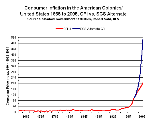
One final chart drives the lesson home, as well as illustrating the impact of the creation of the Federal Reserve in 1913 and the "Nixon Shock," when Richard Nixon ended international convertibility of the dollar to gold, in 1971. Note the shifts in the curve that occurred around those two dates.
Conclusion
So there you have it, folks. Now you know the rest of the story. The next time some talking head on the chatterbox tells you how things are, that things are improving and that the economy will soon be back under control, you know where to go to get the real scoop.
...and that's all I have to say about that.
Addendum: Since this article was written, some Gallup poll data that supports the ShadowStats numbers has surfaced. See the update here.
Author's Note: Shadow Government Statistics grants permission to hot-link all the charts above, as well as quote information on non-subscription pages, as long as credit is given.
No comments:
Post a Comment